I did an analysis on the data for a Kaggle competition from Groupo Bimbo: https://www.kaggle.com/c/grupo-bimbo-inventory-demand/data
Grupo Bimbo is the head corporation owning several baking companies such as Bimbo, Wonder Bread, Tia Rosa, and Marinela. It mainly distributes baked goods such as sliced bread, sweet bread, cookies, tortillas, etc.
The objective of the Kaggle challenge was to train a data set with the nine weeks sales of its products with stores all over the republic of Mexico and predict the demand in future weeks.
The main challenge I faced with the data was the cheer size of it. The training data was 3 GB and over 74 million roles. Neither Google Colab nor Jupyter notebook (platforms where I can use the programming language of Python) could upload it by regular means (much less Excel). While I could have applied some chunking techniques, the model would have taken days to finalize. Instead I used R (programming language that allows me to read giant data sets) to filter the stores in the data set and kept those from the OXXO store chain.
Oxxo is a Mexican chain of convenience stores similar to a 7-Eleven which in 2020 has about 19,500 stores opened. This is the largest chain in the American continent. The Kaggle challenge was published almost five years ago and has 6,682 OXXO stores (the total amount of stores individual stores in the data set was almost a million). In mid 2008 store number 6,000 open while 2009 ended with 7,300 which means the data set must be between this time period assuming it’s complete, but there’s no indication as to what year we’re analyzing.


So the data is therefore an analysis of Grupo Bimbo products inside OXXO stores, and thus we’re analyzing the product demand for these products inside the OXXO stores.
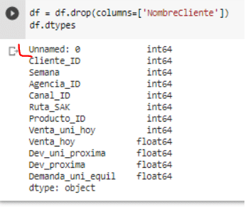
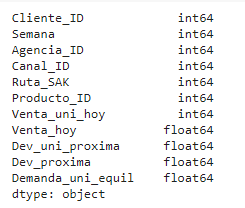
A reference to the data fields which will show up is as follows:
Data fields
- Semana — Week number (From Thursday to Wednesday)
- Agencia_ID — Sales Depot ID
- Canal_ID — Sales Channel ID
- Ruta_SAK — Route ID (Several routes = Sales Depot)
- Cliente_ID — Client ID
- NombreCliente — Client name
- Producto_ID — Product ID
- NombreProducto — Product Name
- Venta_uni_hoy — Sales unit this week (integer)
- Venta_hoy — Sales this week (unit: pesos)
- Dev_uni_proxima — Returns unit next week (integer)
- Dev_proxima — Returns next week (unit: pesos)
- Demanda_uni_equil — Adjusted Demand (integer) (This is the target you will predict)
Data fields
DATA CLEANUP
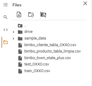
As already mentioned I had to go to R in order to upload, filter and extract the training data that only contained OXXO stores.
Another issue with the data was the same product having a slight different name. In the example below you can see the product “Nito 1p 62g” swing up several times. In order to improve my visualizations and be able to extract the bestselling products I cleaned up the data set and was able to group them.
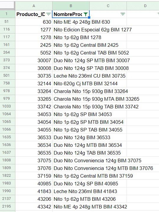
There are 253 products listed (by the cleaned name, not by product ID). These may include variations of the same product. For example: Gansitos may be sold individually (the bestseller of the data set) but there’s also the variation with two per package or a box, which will be listed as separate products.
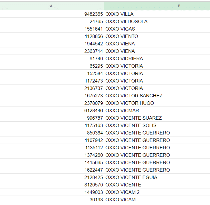
The OXXO stores also have repeated stores listed as individual ID’s. I had to do some basic data cleanup, list them all uppercase, change roman numerals as “II” to arabic numerals, etc.
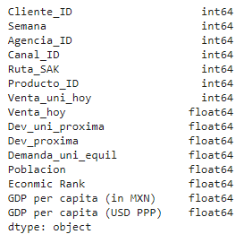
In order to improve the visualizations I added the coordinates of the states the stores are in, along with population size, GDP and PPP. I plan to run two different models with and without these added features and see if they affect the accuracy.
All new uploaded files have had the data cleaned (products and clients names), filtered (OXXO stores only) and content added (state info such as population, PPP, GDP, coordinates). This cleaned up data is now able to be introduced into Google Colab.
VISUALIZATIONS
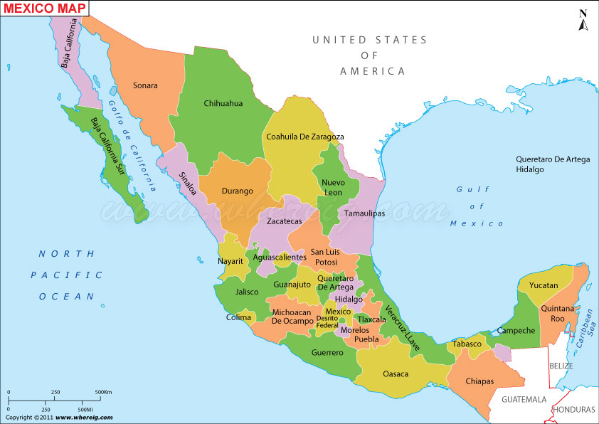
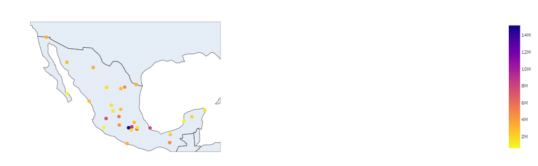
Since the data is divided between state, I thought it would be easier to interpret it with some maps. If you’re not familiar with a map of Mexico here’s one for reference:
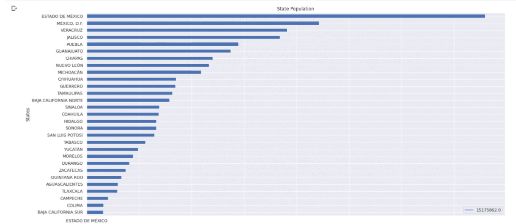
The following map gives you an idea of the population per state:
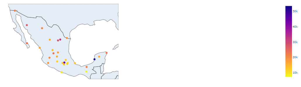
The following gives you an economic rank, from first to last place based on the percentage of GDP from the country:
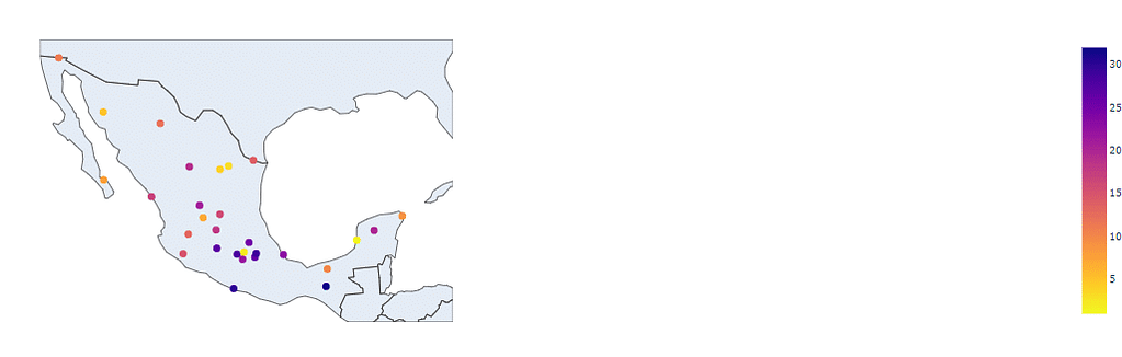
The following map goes over the PPP of each state. I assumed that it would make a difference in purchasing. Either more sales from higher available income, or less as a wealthier population makes them more health conscious, which affects the sales of products from OXXO stores based on data I’ve come across in the past.
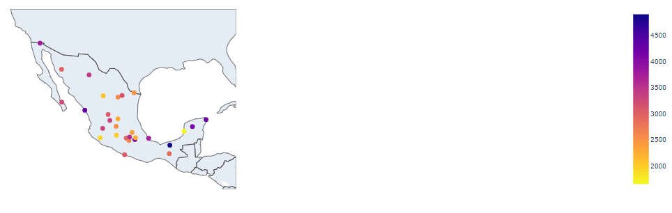
Total Amount of Sales made in Pesos:
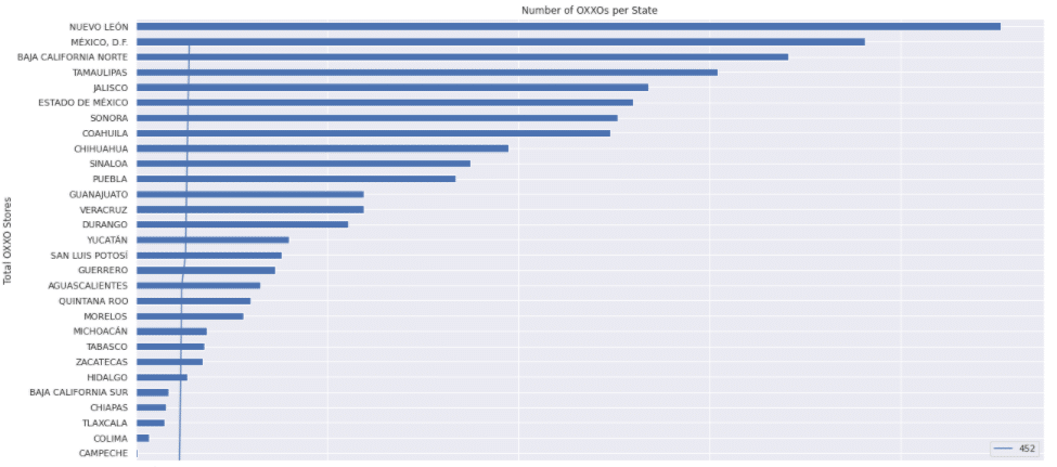
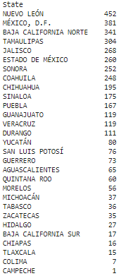
Number of OXXO stores per State:
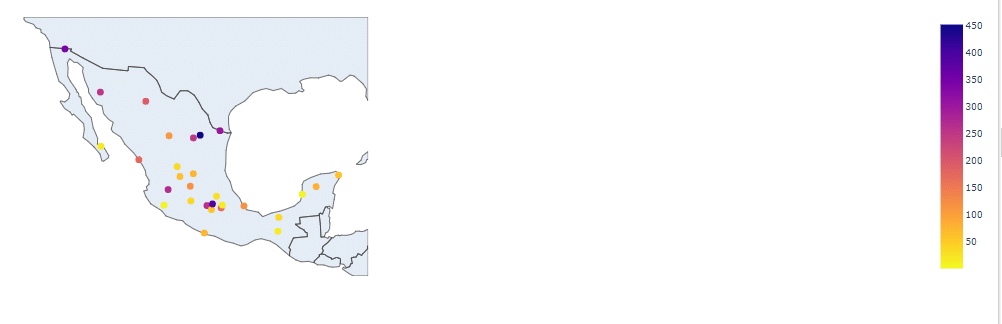
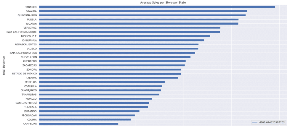
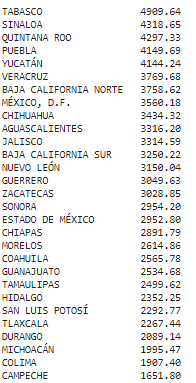
Here’s the average sales per store per week. While the capital might have more total sales due to the greater number of stores, it doesn’t have the best performing stores:
TOP TEN
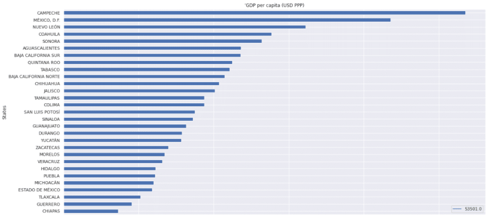
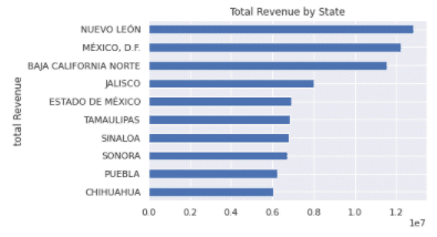
Top Ten States producing most revenue:
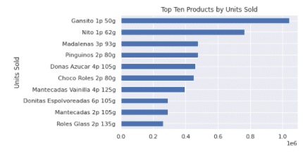
Top ten products by units sold:
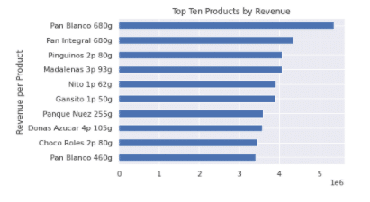
Top ten products by revenue generated:
BUILDING THE MODEL
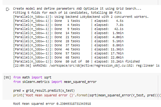
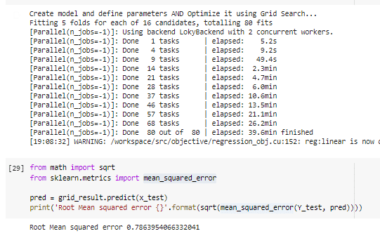
It’s a regression model for which I used GridSearchCV . I ran two models with different features to see if it made a difference in the results.
Interpreting the data: The purpose of this model is do guess the demand for the Grupo Bimbo products in the store. It has two parts:
Training data: This is where the machine learning finds patterns in the data and makes predictions based on this pattern.
Testing Data: After the model was trained, it’s contrasted with the testing data in order to predict what the result should be. The closer the prediction is to the test data, the more accurate the machine learnings results.
In order to judge the accuracy I’ll be using what’s called the root mean square error. This will measure the difference between the sample data and de prediction results. Oversimplified example to show the basic dynamic: If the model predicted 5, but the test showed 6, it has an error of 1. If it predicted 5.5 it has an error of 0.5. The lower the score, the more accurate the model. In a nutshell: It’s the difference between the predicted values and actual values (from test or real data).
RMSE is quadratic scoring that measures the average magnitude of error. It’s the square root of the average of squared differences between prediction and actual observation. Based on a rule of thumb, it can be said that RMSE values between 0.2 and 0.5 shows that the model can relatively predict the data accurately.
FIRST MODEL
The first model gave me a Root Mean Square Error of 0.23 which was the most accurate of the two trials.
Features used (the equivalent of columns in a spreadsheet):
Machine Learning Results:
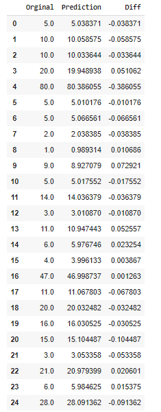
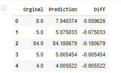
An example of the difference between the predicted and original data:
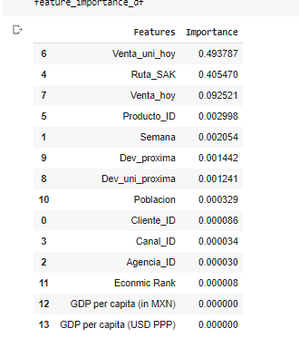
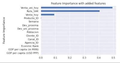
Feature Importance (predicts how useful a feature is in predicting the outcome):
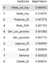
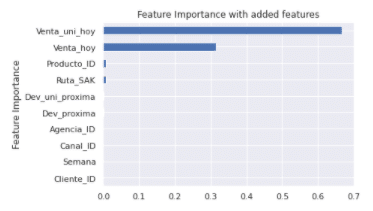
The main predictor for future demand was the sales of the units. The second was the revenue generated. Product ID and route were minor. The model might improve if the rest of the features are removed.
Second Model
The model will use what’s called the root mean square error to determine the results.
For the second model I kept the added features used for the visualizations, the population size, GDP, PPP.
In this occasion, the Root Mean Square Error was 0.78
Features used (the equivalent of a column in a spreadsheet):
Machine Learning results:
Example of the difference between predicted and original data:
To my surprise the economic and population data doesn’t become an important feature, while Ruta_SAK (routes) became the second most important. Units sold is will the most important feature for the demanded units in the future weeks.
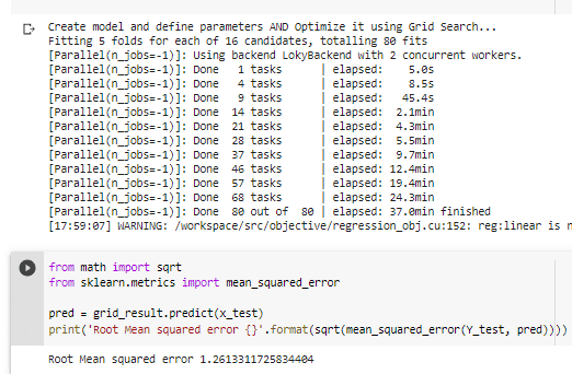
Bonus model
The original model I had kept a trash feature which was basically a repeat of the index listed as a separate column. This model gave me a Root Mean Square Error of 1.26, which shows the drastic difference in the results through feature selection.